
So you ran a digital campaign and in return you are given a confusing report showing the delivery results- typically impressions, clicks, and CTR. Now what do you do with it? What does the report mean about your campaign success and how can you learn from it to improve your marketing strategy? Where did all of the impressions and clicks come from and what story do they tell?

At Enradius, we are taking a deeper dive into reporting data in order to learn about how your audience responded to your campaign, where there was success, and what you can learn about your campaign performance.
What we can track from campaigns has improved, and in addition to seeing impressions and clicks, we can now see where the data served geographically and by audience demographics. We’re using 3D and heat mapping technology to visualize campaign results and easily show comparisons, along with tables and graphs of campaign demographics to tell the campaign story and adjust your marketing strategy going forward.
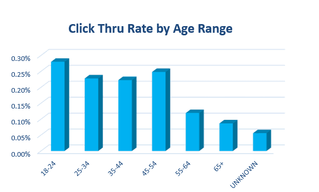 Visualization of demographic data.
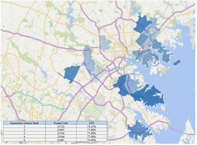 Map shows OTT video views across the region
– written by Pamela Fasolo, Senior Digital Sales Strategist. For help with your digital media strategy and management, contact [email protected].